 Github Stars:
 Last Commit:
  Created:
Overview
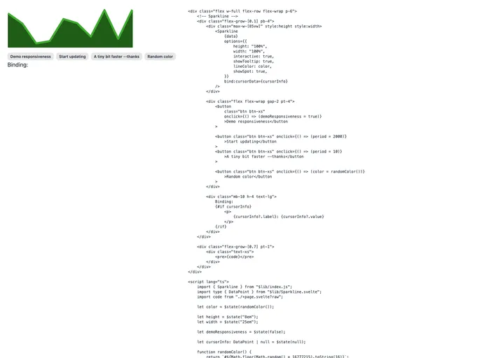
The Sparkline component for Svelte 5 is an impressive tool for those looking to visualize data trends compactly without overwhelming the user with details. Designed with responsiveness in mind, this lightweight library is perfect for dashboards and reports, providing users with quick snapshots of their data. With its clean SVG output, it scales beautifully across different devices, ensuring that data remains easy to understand regardless of screen size.
What’s particularly appealing is the ease of use this component offers. By leveraging Svelte 5’s reactive capabilities, any changes to the data automatically update the sparkline, making it a dynamic addition to any project. Whether you’re a developer looking to enhance the user interface of an application or simply want to represent data visually in a more engaging way, the Sparkline component stands out as a fantastic option.
Features
Lightweight and Customizable: Designed to be minimalistic while allowing for extensive customization to match your design requirements.
Responsive SVG Output: Automatically scales to fit its container, ensuring optimal display on various screen sizes.
Dynamic Reactivity: Reactively updates the chart as data changes, thanks to the capabilities of Svelte 5, ensuring your visuals are always up-to-date.
Customizable Appearance: Supports a variety of options, including line color and tooltip settings, allowing creators to fine-tune the visuals to their liking.
Interactive Tooltips: Enables users to interact with the chart, showing comprehensive data points upon hovering, thus enhancing user engagement.
Multi-Data Format Support: Accepts both arrays of numbers and objects with labels and values, providing flexibility in how data can be visualized.
Easy Installation: Can be quickly installed via npm, making it convenient to incorporate into existing Svelte projects.
Supports Touchscreens: Works seamlessly across all browsers and devices, including those with touchscreens, ensuring a wide range of accessibility.