 Github Stars:
 Last Commit:
  Created:
Overview
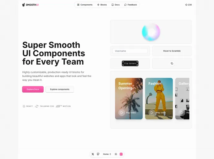
SmoothUI is a vibrant collection of React components crafted with modern design principles and enhanced functionality. Utilizing Tailwind CSS and Motion, this library focuses on providing developers with reusable UI elements that not only look great but also function seamlessly. Whether you’re building a straightforward application or embarking on a complex project, SmoothUI aims to enhance user interaction through delightful animations and an intuitive design aesthetic.
The framework is particularly well-suited for anyone looking to incorporate stylish, responsive, and easily customizable components into their workflow. With its commitment to accessibility and TypeScript support, SmoothUI caters to a diverse range of needs, making it an excellent choice for frontend developers aiming to elevate their user experiences.
Features
- Modern Design System: Enjoy a cohesive design language coupled with a new mascot, Smoothy, creating a friendly and engaging interface.
- Smooth Animations: Experience delightful transitions powered by Motion, adding a polished touch to user interactions.
- Responsive Design: Fully responsive components that adapt seamlessly to different screen sizes, ensuring a great user experience on any device.
- Dark Mode Support: Effortlessly switch between light and dark themes, catering to users’ preferences right out of the box.
- Color Customization: Easily customize themes with a dynamic color switcher, allowing developers to align components with branding needs.
- Comprehensive Documentation: Detailed guidelines on props, examples, and usage make it easy to integrate and utilize components effectively.
- Accessibility: Enhanced accessibility features ensure that all components are usable by a broader audience, improving inclusivity.
- TypeScript Support: Full support for TypeScript with type definitions helps prevent runtime errors and improves code maintainability.
- Easy Integration: With a simple API, developers can quickly incorporate SmoothUI components into their projects without hassle.