 Github Stars:
 Last Commit:
  Created:
Overview
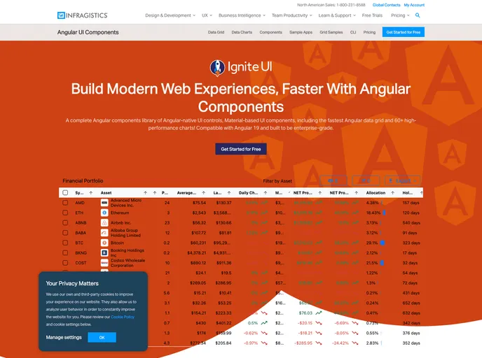
The Ignite UI for Angular Samples project offers an incredibly versatile framework for developers looking to harness the power of Ignite UI components within Angular applications. This comprehensive project serves as a demonstration of various Ignite UI components across different scenarios, making it an invaluable resource for anyone working with Angular. The structure is neatly divided into two applications; one that demonstrates a default application showcasing all components, and another for a Line of Business application that incorporates both charts and Excel capabilities.
This project not only supports modern development practices but also facilitates live editing environments, greatly enhancing productivity and learning for developers. Furthermore, its integration with the DocFX Site Builder ensures that documentation and samples work hand-in-hand, providing a seamless experience for users.
Features
Component Variety: Demonstrates a wide array of Ignite UI components, allowing developers to see practical applications and usage scenarios.
Default and Line of Business Apps: Offers two separate applications to cater to different user needs – one for general use and one targeting specific business functionalities.
Development Server: Easily start a dev server for both applications, with commands tailored for modern browsers and live editing support.
Live Editing Capabilities: Live-editing functionality allows developers to see changes in real-time, which is essential for rapid development and iterative design processes.
Configurators for Components: Each Ignite UI component comes with its own configuration generator, simplifying the customization and setup process.
Integration with DocFX: Enables the embedding of live samples within the DocFX Site Builder, enhancing the documentation with hands-on examples.
Sass and CSS Support: Offers flexibility in styling, allowing developers to choose between Sass and CSS for their projects.
Watch Commands: Provides the ability to regenerate live editing JSON files on the fly, making it easier to test and see changes immediately.