 Github Stars:
 Last Commit:
  Created:
Overview
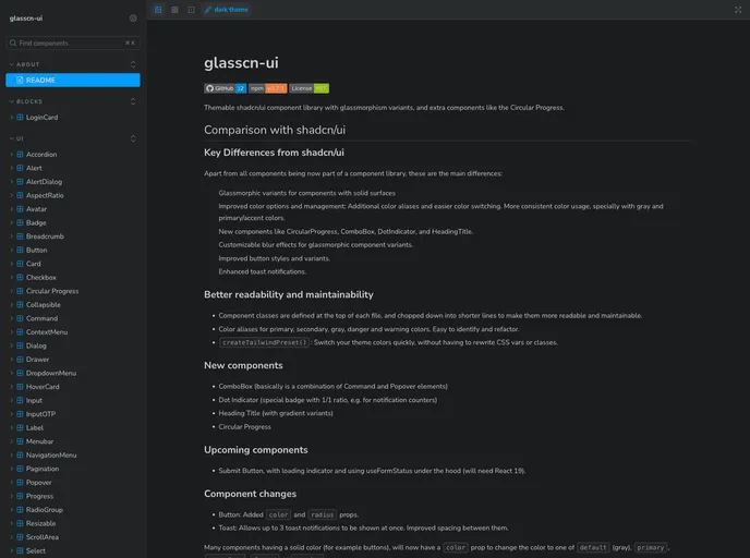
The glasscn/ui component library stands out as a specialized tool for developers seeking to enhance their projects with modern design aesthetics, specifically leveraging glassmorphism. With a suite of new and improved components, it offers a flexible and visually appealing way to create user interfaces. This library not only embraces the latest design trends but also simplifies color management and customization, making it a valuable addition for those using Tailwind CSS.
From its innovative components like Circular Progress and Dot Indicator to improved button styles and toast notifications, glasscn/ui enhances both usability and design consistency. The thoughtful organization of component classes ensures better readability and maintainability for developers, while the tailored glassmorphic variants add an extra layer of visual interest to the overall UI.
Features
Glassmorphic Variants: Offer unique aesthetics with customizable blur effects for dialogs and popovers, enriching the overall visual appeal of components.
New Component Additions: Includes versatile elements like Circular Progress, ComboBox, and Heading Title with gradient variants, expanding the library’s functionality.
Improved Color Management: Enjoy better color usage with additional aliases and simplified switching, streamlining the design process.
Customizable Button Styles: Enhanced button options with added color and radius properties, promoting better adaptability to design needs.
Enhanced Toast Notifications: Supports multiple concurrent toast notifications, with improved spacing for better visibility and interaction.
Tailwind Integration: Installation and setup are streamlined for Tailwind CSS users, ensuring seamless incorporation into existing projects.
CreateTailwindPreset Function: Quickly switch theme colors without extensive CSS changes, simplifying the customization process.
Maintainability Features: Component classes are defined for clarity, breaking down complex code into manageable segments for easier updates and readability.