 Github Stars:
 Last Commit:
  Created:
Overview
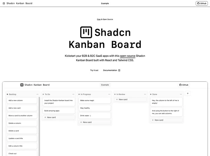
The Shadcn/UI Kanban Board is a modern solution designed for developers looking to build full-stack B2B and B2C SaaS applications. With its focus on accessibility, performance, and seamless theming, this Kanban board offers a comprehensive tool for managing tasks and workflows effectively. Its ability to easily integrate with Shadcn/UI makes it an appealing choice for those wanting a polished and user-friendly experience.
Whether you’re building a simple project management tool or a complex application, the Shadcn/UI Kanban Board provides the flexibility and features necessary to meet diverse needs. With a range of functionalities from drag-and-drop capabilities to accessibility features, it aims to enhance productivity while maintaining a modern aesthetic.
Features
Zero-Dependencies: Built entirely in React, it requires no additional libraries, ensuring a lightweight setup and straightforward maintenance.
Performance Assurance: The useJsLoaded hook allows for a smooth user experience by displaying a skeleton until all styles and scripts are fully loaded.
Accessibility-First: The board is designed with full keyboard controls and screen-reader announcements, making it usable for all individuals, regardless of ability.
Seamless Theming: Automatically adjusts to your Shadcn/UI color scheme, ensuring a consistent look and feel tailored to your application’s branding.
Framework-Agnostic: Compatible with various state management solutions including local state, React Router v7 actions, and Next.js Server Actions, making it versatile for different tech stacks.
Extensible APIs: Provides customizable drag-and-drop monitors and announcement handlers, allowing developers to tailor the functionality to their specific use cases.
Dynamic Columns & Cards: Easily add or remove columns and cards while ensuring that the latest additions remain in view, enhancing user experience with auto-scroll features.
Inline Editing: Users can directly edit titles of columns and cards in place, streamlining the process and minimizing distractions.