 Github Stars:
 Last Commit:
  Created:
Overview
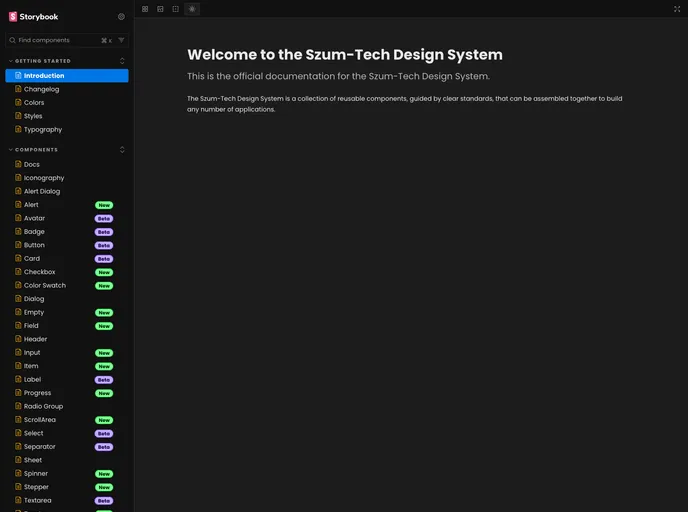
The Szum-Tech Design System is a design system supported by the Tailwindcss library. It allows the creation of applications that support light and dark themes. The design system includes UI React Components and a color palette that complies with Szum-Tech standards.
Features
- Support for light and dark themes
- UI React Components
- Compliant color palette
Installation
To install the Szum-Tech Design System, follow these steps:
Install the design system package using npm or yarn:
npm install @szum-tech/design-systemor
yarn add @szum-tech/design-systemDuring Tailwind initialization, modify the
tailwind.config.jsfile:- Add the path to
@szum-tech/design-systemUI Components files. - Add the preset file to Tailwind configuration.
- Add the path to
Import the theme styles to a CSS file with Tailwind directives:
- Import the CSS file from
@szum-tech/design-system/themewhich includes the colors palette for the dark and light themes and default styles.
- Import the CSS file from
Summary
The Szum-Tech Design System is a design system supported by the Tailwindcss library. It allows the creation of applications with light and dark themes and provides UI React Components and a compliant color palette. To install the design system, use npm or yarn and configure Tailwind accordingly.