 Github Stars:
 Last Commit:
  Created:
Overview:
If you’re looking for a hassle-free way to implement an OTP (One-Time Password) input component in your Svelte applications, the Svelte-OTP component is a fantastic option. Its lightweight nature and easy integration make it an essential tool for developers who want to enhance user authentication processes without compromising on style or functionality. With a few simple configurations, you can have a fully functional OTP input ready to go in no time.
What sets this component apart is its versatility. From controlling input states to customizing designs, Svelte-OTP allows for a highly flexible and user-friendly experience. Whether you’re building a quick login feature or a secure transaction verification process, this input component fits seamlessly into your project.
Features:
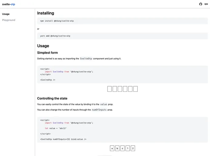
- Easy Integration: Simply import the SvelteOtp component and start using it right away without complex setup procedures.
- Customizable Input Count: Adjust the number of input fields displayed by modifying the
numOfInputsprop, allowing for flexibility according to your use case. - Value Control: Bind the OTP value through the
valueprop, making it easy to manage and retrieve the user input. - Number Restriction: Use the
numberOnlyattribute to restrict input to numerical values only, enhancing security for OTP entries. - Styling Options: Style the component to fit your design aesthetic with parameters like
inputStyle,wrapperStyle, and class names. - Placeholder Capabilities: Add custom placeholder text for each input using the
placeholderprop, improving user guidance during input. - Separator Customization: Define a separator between inputs using the
separatorprop and control its visibility based on input count. - Default Style Control: Disable or customize the component’s default styling by using the
disableDefaultStyleattribute, giving you complete control over the look and feel.