 Github Stars:
 Last Commit:
  Created:
Overview
Discover a refined collection of UI components that seamlessly combine accessibility, speed, and aesthetic appeal. Built with React, Tailwind CSS, and Ark UI, this library ensures a flawless user experience that developers can rely on. It addresses the growing need for high-quality components that not only look great but also function effectively in diverse applications.
This UI component library prioritizes accessibility and provides a robust developer experience through strong typing. The combination of advanced technologies like React 19 and Tailwind CSS 4 enables developers to create modern applications effortlessly while maintaining a consistent design.
Features
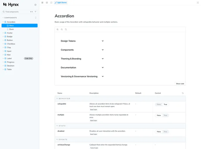
- Accessible - Built on top of Ark UI with full ARIA support, ensuring that users with disabilities can effectively interact with all components.
- Type-safe - TypeScript is implemented throughout the entire project to enhance code quality and reduce runtime errors.
- Modern - Utilizes up-to-date versions of React 19 and Tailwind CSS 4 for a contemporary and flexible design framework.
- Themeable - Includes native support for light and dark modes, allowing developers to adapt the UI based on user preferences.
- Documented - Comprehensive documentation for all components is available in Storybook, easing the learning curve for developers.
- License - Released under the MIT License, permitting wide usage and modification in various projects.