 Github Stars:
 Last Commit:
  Created:
Overview
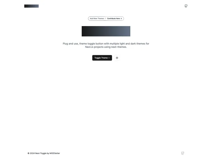
Next-Toggle is an innovative theme toggle button designed for web projects that utilize the next-themes library. With its simple plug-and-use interface, it allows developers to effortlessly switch between multiple light and dark themes, enhancing user experience and visual appeal. This tool is particularly beneficial for developers looking to add a polished touch to their applications while ensuring compatibility with various UI libraries.
Implementing Next-Toggle in your project is straightforward, as it leverages the useTheme hook alongside background snippets for seamless theme transitions. Whether you’re an experienced developer or just starting, Next-Toggle provides a user-friendly solution to improve the aesthetic dynamics of your web applications.
Features
- Easy Implementation: Simply copy the Next-Toggle component into your project and start using it without extensive configuration.
- Multiple Themes: Choose from a variety of light and dark themes to customize the aesthetic of your web project.
- Utilizes next-themes: Built on the robust next-themes library, ensuring reliable theme management across your application.
- Flexible UI Compatibility: Create your own theme toggler components using any UI library, giving you the freedom to personalize your design.
- Community Contribution: Encourages users to add background snippets and improve the component, fostering community-driven development.
- Quality of Life Improvements: Open to suggestions and enhancements, allowing for continuous upgrades based on user feedback.