 Github Stars:
 Last Commit:
  Created:
## Overview
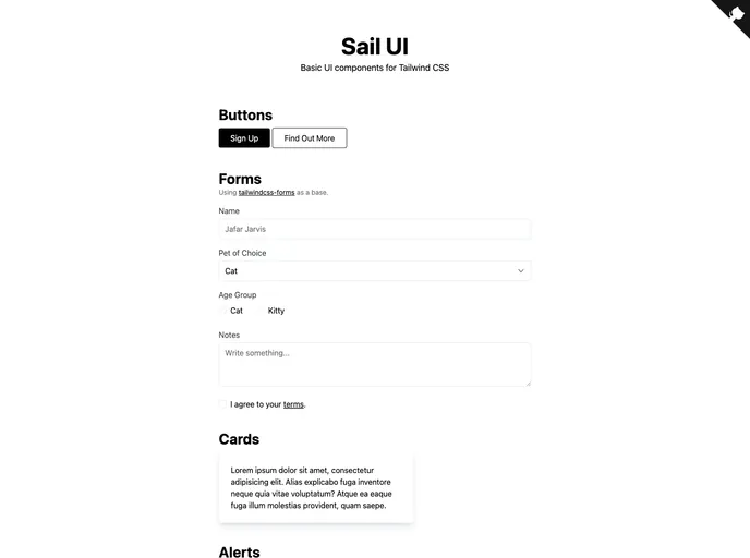
UI is a collection of basic UI components specifically designed for Tailwind CSS. Tailwind CSS is well-loved for its utility-first approach, enabling developers to create highly customizable and modern user interfaces with ease. With this component library, you gain a streamlined way to implement responsive and visually appealing design without reinventing the wheel.
The components included in this UI library are meticulously crafted to blend seamlessly with various design styles, providing a foundation to enhance your projects. Whether you're building a simple web application or a more complex platform, these components can help accelerate your development process while ensuring a polished look.
## Features
- **Responsive Design**: All components are built to be responsive, ensuring that your application looks great on screens of all sizes.
- **Customizable**: With Tailwind CSS's utility-first approach, you can easily customize each component to fit your project's specific needs.
- **Dark Mode Compatibility**: Many components support dark mode styling, allowing for a more user-friendly experience in various lighting conditions.
- **Accessibility Features**: Components are designed with accessibility in mind, making it easier for all users to navigate and interact with your UI.
- **Easy Integration**: Seamlessly incorporate components into your existing projects without extensive setup or configuration.
- **Pre-styled Variants**: Each component comes with pre-styled variants, providing a quick solution for different usages like buttons, forms, and more.
- **Documentation**: Comprehensive documentation is available, making it easy for developers to get started and implement the components effectively.